Kinetic typography is a specific skill in the field of motion graphics design.
It is basically setting text in motion. Sometimes graphic elements are additionned (eg: illustrations, icons, photos, videos, etc.), thanks to arrival effects, transitions or even deformations.
Historically, kinectic typography was used for film credits (eg: « North by Northwest »), but the development of marketing video has opened up a much wider field. And so, it is also frequently found in music videos (eg: « Excuse-moi » by Philippe Katerine), web design and a lot of motion graphics animations.
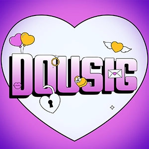
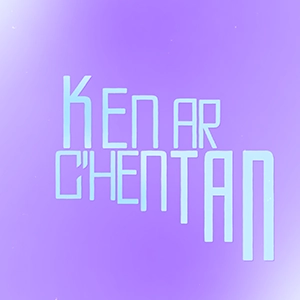
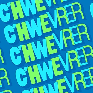
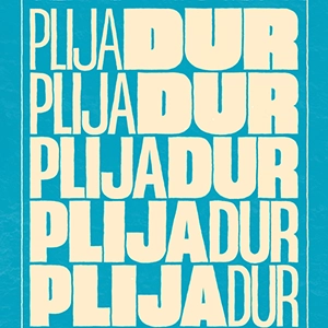
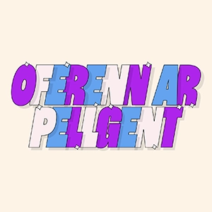
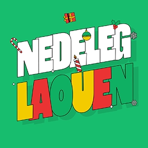
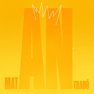
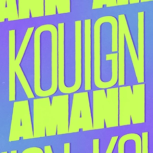
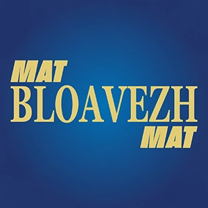
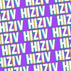
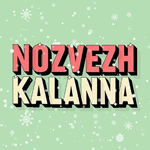
Above, you can find some examples of kinetic typography animations I made as part of promoting the Breton language.
These animations focus on modification and distortion of the fonts themselves.
To view more of that kind of animations, go on my Instagram!
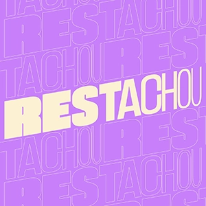
Promotion de la bretagne
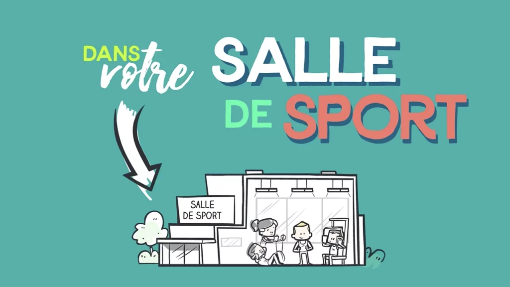
Pour ce projet-ci, j’ai utilisé la même technique d’animation de typographie cinétique qu’au-dessus, mais pour servir un objectif un peu différent.
Le but de ce projet était de créer une typographie qui pourrait, à la fois, être illustrée dans un magazine ou sur une plaquette, au format print donc. Mais également animée en vue d’être postée sur un site web, sur les réseaux sociaux ou dans le cadre d’une vidéo de promotion plus complète.
Un double format qui fonctionne parfaitement pour toute entreprise utilisant des supports de communication papier en parallèle de leur communication digitale.
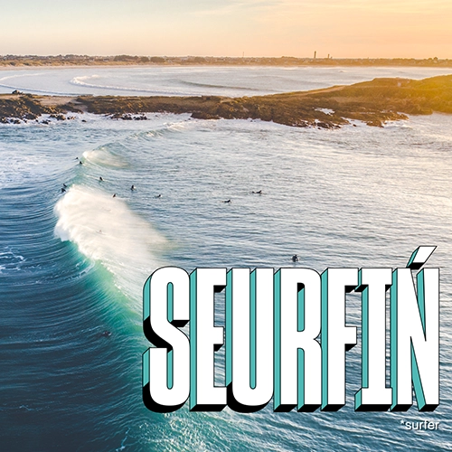
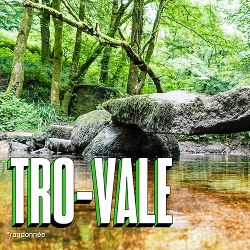
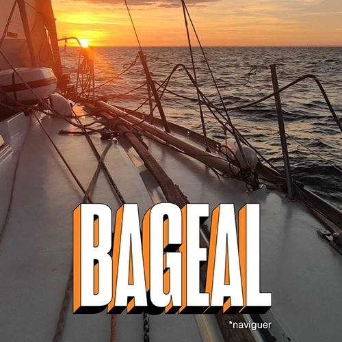
Ces illustrations qui mettent à l’honneur les loisirs extérieurs en Bretagne représentent :
– le surf (seurfiñ en breton), ici sur le magnifique spot de La Torche dans le Finistère (29). Crédit photo : Thibault Poriel
– la randonnée (tro-vale en breton), ici dans la forêt de Huelgoat dans le Finistère (29). Crédit photo : Markus Thoenen
– la voile (bageal en breton), ici dans la rade de Brest, également dans le Finistère (29). Crédit photo : Rozenn Gourvès-Cousin
MOTION DESIGN EN TYPOGRAPHIE CINÉTIQUE
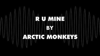
Ici, vous trouverez un autre type d’animation de typographie cinétique. Cette fois, ce sont les mots et les phrases qui sont animés, sans déformation de la police de caractères. The finish must be dynamic and readable. Words’ arrival and transitions are synchronized to the music. And graphic elements or photographs are added to highlight the style of the video (corporate, animated, etc.).